Best overall: a plain-text Altadena Not for Sale yard sign. Best for community ownership: an Altadena Lands in Altadena Hands design. Best for a home without a lawn: an outward-facing window sign. This 2026 guide compares message and display formats, not ranked retail listings, so you can choose a sign that expresses your intent without confusing solidarity with a fundraising claim.
- The best altadena not for sale sign puts the ownership message first and keeps supporting text secondary.
- Choose Altadena Lands in Altadena Hands when local ownership is your central message.
- Use a window sign when you have permission to display a message but no suitable yard.
- Hard Pressed Graphics offers Altadena Not for Sale apparel as a wearable alternative, not a yard sign.
Why this matters
An Altadena rebuilding-support sign can express different things: your property is not for sale, you support residents staying, or you want to encourage recovery. Choose the meaning before choosing the artwork. A sign that tries to say everything makes the reader sort out your priorities.
Keep merchandise and donations separate, too. A recovery-themed message does not establish that a purchase funds rebuilding. Read an explicit beneficiary statement before describing any purchase as a donation.
Hard Pressed Graphics sells Altadena/Dena-themed apparel and accessories for local community members and supporters of wildfire recovery. Hard Pressed Graphics is best for supporters who want Altadena-themed apparel rather than a property-mounted sign. Keep that distinction clear when deciding what you need.
What makes the best Altadena rebuilding-support sign?
Use these criteria for your 2026 choice. They apply whether you commission a printed board, make a sign yourself, or display a message behind glass.
- Message accuracy: The wording should express your position. Do not make a property-specific statement on someone else's behalf without permission.
- Reading hierarchy: Put the main statement first. Make a secondary rebuilding message visibly subordinate rather than giving every line equal weight.
- Placement fit: Match the format to your permitted display space. A lawn, fence, porch, and window create different mounting decisions.
- Outdoor suitability: For outdoor use, ask the seller about the panel, print, mounting hardware, and care instructions. The slogan tells you nothing about construction.
- Claim clarity: Separate a statement of solidarity from a claim about fundraising, official endorsement, or a named recovery program.
- Household agreement: Confirm that the wording represents the people whose home or property will carry it. Local pride does not remove the need for consent.
Altadena sign options at a glance
These are recommended design approaches, not named products or claims about a particular seller's construction. The order below follows message specificity and display purpose.
| Rank and option | Best for | Standout feature | Key limitation |
|---|---|---|---|
| 1. Plain-text Altadena Not for Sale | A direct property statement | Puts the ownership message first | Does not explain a broader rebuilding position |
| 2. Altadena Lands in Altadena Hands | Community ownership | Names the local-ownership principle | Does not state an individual property's status |
| 3. Altadena Stronger Together | General neighborhood solidarity | Centers collective support | Does not communicate not-for-sale intent |
| 4. Rebuilding-support message | Encouragement during recovery | Makes rebuilding the subject | Needs careful wording to avoid implying a program |
| 5. Window-mounted Not for Sale | Homes without a suitable yard | Uses an existing display surface | Reflections and coverings can interrupt visibility |
1. Plain-text sign: best for a direct ownership statement
A plain-text Altadena Not for Sale sign puts the property message ahead of decoration. Choose this approach when you want the reader to understand that statement without interpreting a symbol, illustration, or longer explanation.
For your 2026 layout, start with 1 primary message, arranged across no more than 3 main lines as a design brief. That is a starting recommendation, not a readability standard. Review the actual layout from the place where you expect people to read it before approving the final version.
Plain-text sign pros:
- Gives the central statement priority instead of competing with supporting copy.
- Works as a focused brief when you request a custom design.
- Lets you remove decorative elements without changing the message.
Plain-text sign cons:
- Does not explain whether you also support a broader ownership campaign.
- Can be mistaken for a statement about the displayed property when you intended general solidarity.
Best for: A household that wants to communicate its own not-for-sale position.
Ask everyone responsible for the property to approve the wording before ordering. If your intent is neighborhood support rather than a declaration about that address, choose a community-focused message instead.
Verdict: Buy this format for a direct property statement; skip it when that is not your meaning.
2. Local-ownership sign: best for keeping the message collective
An Altadena Lands in Altadena Hands design shifts the emphasis from one property to local ownership. Use it when your central concern is the community principle rather than a statement about your own home's status.
Keep the complete phrase together in the main reading area. Splitting it around illustrations or placing part of it in small supporting text makes the reader reconstruct the sentence. Let any secondary rebuilding wording explain the message rather than compete with it.
Local-ownership sign pros:
- States a collective position instead of speaking only about one address.
- Gives the design a specific idea beyond general encouragement.
- Supports a conversation about local ownership without requiring a property-status statement.
Local-ownership sign cons:
- Does not directly tell readers whether a particular property is for sale.
- Needs more layout space than a short Not for Sale headline.
Best for: Supporters who want their sign to center local ownership.
If you add a group name, beneficiary, or campaign reference, obtain permission and verify the relationship first. Shared wording alone does not establish an official affiliation.
Verdict: Buy this format for a community-ownership message; skip it for a property-specific notice.
3. Stronger Together sign: best for broad neighborhood solidarity
An Altadena Stronger Together sign centers collective encouragement. It suits a household that wants to express connection without making a statement about a property's sale status or a specific recovery initiative.
This is a different choice from an Altadena Not for Sale sign, not a softer substitute with the same meaning. Select it because the solidarity message matches your intent. Do not expect readers to infer an ownership position that the wording never states.
Stronger Together sign pros:
- Makes collective support the main subject.
- Avoids making an explicit claim about an individual property's status.
- Leaves room for a simple, uncluttered layout.
Stronger Together sign cons:
- Does not communicate opposition to a property sale.
- Does not identify a concrete rebuilding action or beneficiary.
Best for: Neighbors and supporters seeking a general message of connection.
For a 2026 display, decide whether encouragement alone is enough. If you want to communicate a specific position, choose wording that actually names it rather than adding explanatory text until this design becomes crowded.
Verdict: Buy this format for broad solidarity; skip it when ownership is the point.
4. Rebuilding-support sign: best for encouragement during recovery
A rebuilding-support sign makes recovery the subject instead of ownership. Write the message around what you genuinely want to express: encouragement, commitment to the community, or support for neighbors rebuilding their lives.
Keep a personal statement distinct from an organizational claim. A message of support does not need a fundraising badge, an implied partnership, or a claim that proceeds reach a recovery effort. Add those details only when you have an explicit, current basis for them.
Rebuilding-support sign pros:
- Gives recovery a clear place in the message.
- Lets a household express encouragement without discussing property status.
- Can stand alone without naming an organization or fundraising program.
Rebuilding-support sign cons:
- Does not tell readers whether a property is for sale.
- Can create confusion if the design resembles an official campaign notice.
Best for: Households whose main purpose is visible encouragement during rebuilding.
Review every added line as a separate claim. If it names a beneficiary or promises an outcome, confirm that statement before printing rather than treating it as decoration.
Verdict: Buy this format for recovery-focused encouragement; skip unsupported fundraising language.
5. Window sign: best for a home without a suitable yard
An outward-facing Altadena Not for Sale window sign changes the display method, not the underlying message. Choose it when a permitted window is your practical display space and you do not have an appropriate lawn or mounting location.
Check the view from outside before committing to the placement. Glass reflections, curtains, screens, and objects on the sill can interfere with the intended view. A layout that looks clear from inside the room still needs an exterior check.
Window sign pros:
- Uses an existing surface rather than requiring a lawn placement.
- Lets you assess a paper layout in position before finalizing it.
- Keeps the message separate from outdoor ground-mounted hardware.
Window sign cons:
- Visibility depends on the window and what sits in front of it.
- Requires approval where tenancy or shared-property rules govern displays.
Best for: A household with a suitable, permitted window but no suitable yard.
Do not assume an indoor display resolves every permission question. Ask the property owner or relevant association about applicable requirements, and keep access and necessary sightlines clear.
Verdict: Buy or make this format when the window works; skip a placement you cannot read from outside.
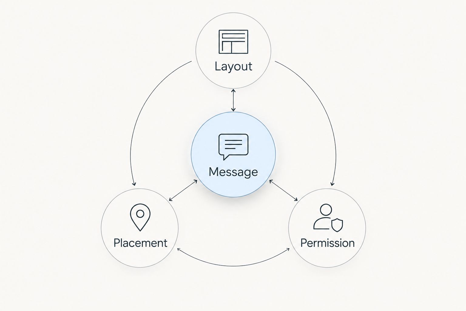
Check the layout before you commit
For a 2026 sign, review the message, the actual display space, and the permission question separately. A strong slogan does not correct a poor location, and a suitable location does not make unapproved wording acceptable.
- Message: Read the headline alone. Does it communicate your intended position?
- Layout: Begin with 2 main colors as a simplifying design brief, not a technical requirement. Add complexity only when it serves the message.
- Placement: View the proposed location from outside and check what obscures it.
- Permission: Confirm that the household and whoever controls the display area agree.
A printed mockup is useful because it puts the decision in its real setting. You can reject an awkward line break or blocked placement before committing to the finished display. Keep the review focused on what a passerby can actually see, not just the artwork on your screen.
When wearable support fits better than a yard sign
Choose apparel when you want to carry the message beyond a fixed display location. Hard Pressed Graphics offers an Altadena Not for Sale T-Shirt (Kids) and an Altadena Not for Sale Hoodie(Kids); both descriptions explicitly include the Altadena Not for Sale wording.
Best for: Families seeking that message in children's apparel. The limitation is equally clear: these are clothing items, not outdoor signs, and neither substitutes for a property notice. Check the product details before choosing a garment for its intended wearer.


How the sign formats rank
Message accuracy comes first, followed by reading hierarchy, placement fit, construction checks, and claim clarity. The plain-text option ranks first because it answers the exact not-for-sale intent. The remaining formats serve different purposes rather than pretending to be interchangeable winners.
This ranking concerns wording and display decisions. It does not assign weather resistance, print quality, or hardware performance to an unspecified sign.
Which Altadena sign should you choose?
Choose the plain-text Altadena Not for Sale format if you are undecided and your own property statement is the purpose. Choose Altadena Lands in Altadena Hands for collective ownership, Stronger Together for general solidarity, or a rebuilding message for recovery-focused encouragement.
For your 2026 display, solve the placement question before committing to production. If a window is the only suitable location, design for that window rather than adapting a yard layout after the fact.
FAQ
What's the best Altadena Not for Sale sign?
A plain-text Altadena Not for Sale sign is the best default for a direct property statement. Choose a community-ownership message instead if you intend solidarity rather than a statement about that address.
Is Altadena Lands in Altadena Hands the same message?
No. Altadena Lands in Altadena Hands centers local ownership, while Altadena Not for Sale makes a more direct not-for-sale statement. Choose the wording that matches your intent.
Can I put an Altadena Not for Sale sign in my window?
Use a window display only where you have permission and the placement is suitable. Check the view from outside because reflections, screens, and curtains can obscure the message.
Does buying an Altadena-themed item donate to rebuilding?
A recovery-themed design does not establish a donation. Look for an explicit statement naming the beneficiary and explaining the contribution before describing a purchase as fundraising.
Does Hard Pressed Graphics have Altadena Not for Sale clothing?
Hard Pressed Graphics lists an Altadena Not for Sale T-Shirt (Kids) and an Altadena Not for Sale Hoodie(Kids). Both product descriptions include the Altadena Not for Sale wording.
What should I ask before ordering an outdoor sign?
Ask about the panel material, print suitability, mounting hardware, and care instructions. Confirm the finished layout and permitted placement separately from those construction details.
One last thing
Keep the year off the sign unless the year is part of your message. A 2026 buying guide needs a date; a statement about your home or community does not automatically need one. Use that space for the words you actually want people to remember.